


Below are three possible logos for the popular drug store Walgreens. I created these in an attempt to rebrand the company for practice. I wanted to continue to use their font that very recognizable, and also play off their past logos. The idea is I would recommend the company buy up older buildings that are local landmarks and use those as their storefronts instead of building new. Doing this would show the community they care and are socially responsible, while also saving them some money. With the older look exterior these logos would fit right in. However, on the interior of the buildings they would renovate and make them look really nice and modern. The result would be a mix of old school and new. This will hopefully help them appeal to a wider audience.
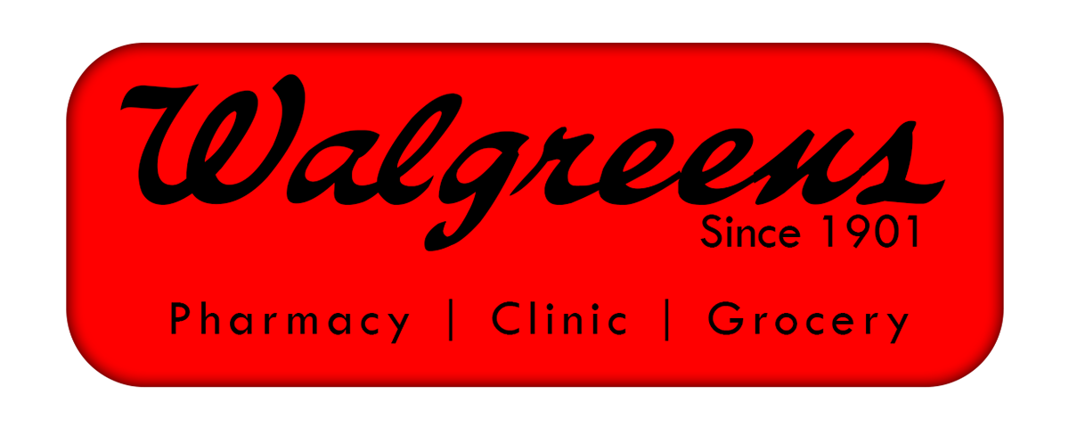


Walgreens has been around since 1901 and is the oldest company of the top three (Walgreens, CVS and Rite Aid). I would recommend they use that, in addition play up the fact that they have a location in all 50 states. In addition many of their stores are within 5 miles of 75% of Americans (about Walgreens, 2016).
So with this in mind I created a social media banner and bus advertisemnt that they could use as examples. The slogan or tag line I'd recommend is:
So with this in mind I created a social media banner and bus advertisemnt that they could use as examples. The slogan or tag line I'd recommend is:
"We are where you're going".


References:
About Walgreens. (2016). Retrieved June 09, 2016, from http://news.walgreens.com/fact-sheets/about-walgreens/


